 Getting started
 Pipeline
 Forecasts
 Deals
Deals Deals (advanced)
 Proposals
 Exports
 Resources
 Integrations
 Settings
 Glossary
 FAQs
FAQs Releases
Themes
IN THIS ARTICLE
Themes are style guide templates that are used to brand your deal presentations. They are managed at the space level.
Accessing themes
Themes are available in the main navigation, or from within a Deal > Presentation > Settings > Edit
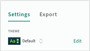 Edit the current theme for a proposal
Theme library
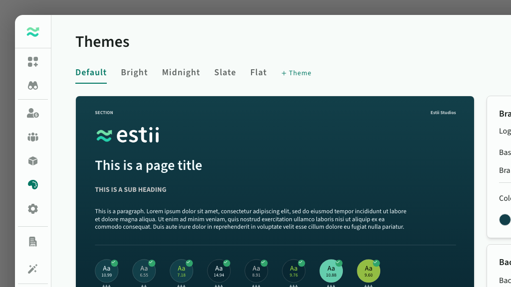
The themes page contains all the themes in your space. From here you can
- Preview existing themes
- Add, remove, duplicate and rename themes
- Edit colours, logos, images and other styles
 The theme library
Managing themes
You can navigate between available themes, add new ones, or remove, rename or duplicate existing ones.
- You cannot delete the default theme, however you can override the default theme with the settings from another one
- You can import and export individual themes - as a backup before major changes, or to copy a theme between spaces
 Navigate between themes by clicking on each tab
Saving changes
The preview updates as you modify styles. Once a theme is modified, an inline confirmation prompt appears to either Save changes or Revert back to the original.
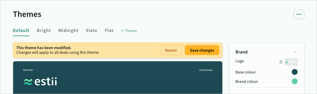 Changes to a theme must be explicitly saved
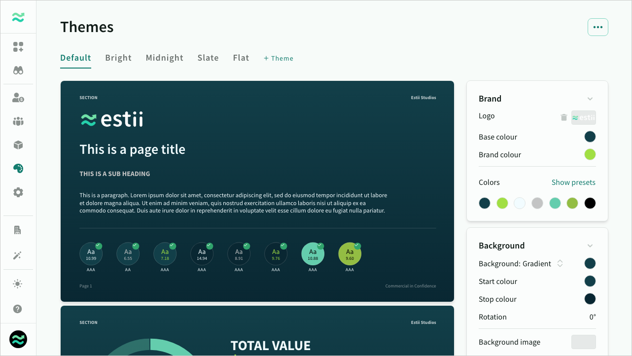
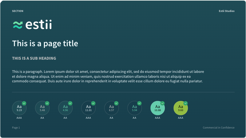
Theme preview
Each theme contains a preview that includes the key styles and components used in the deal templates.
 Preview the colors, fonts and styles of the theme
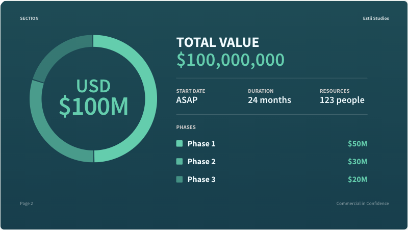 Preview the graphic styles of the theme
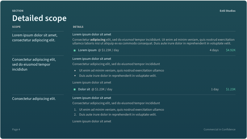
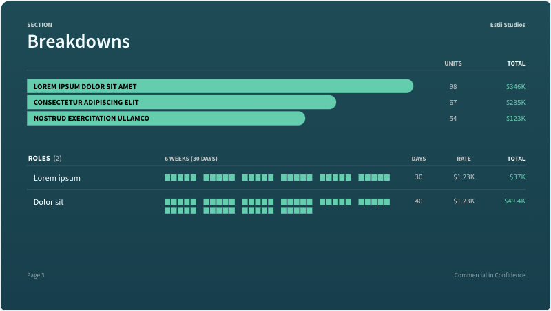 Preview breakdown and schedule styles of the theme
 Preview the table styles of the theme
Accessibility checker
The preview has a built in colour checker that calculates the contrast and accessibility of each text and background colour combination (using the WCAG 2.0 accessibility standard). Colours that fall below the minimum contrast level will display a warning.
This should be used as guide only. Please note that contrast checker does not take into consideration background images (if used)
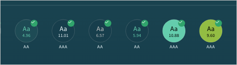 WCAG2.0 colour contrast checker is built into the preview
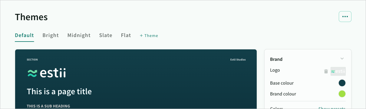
Theme styles
You can modify every element of the theme from the Theme styles panels on the right
Brand styles
Brand determines the logo and colour palette for the theme
When modifying the global colour palette, text colours will automatically snap to white/black based on the contrast of the background colour. The colour picker is pre-populated with logo colours and some other defaults.
You can
- upload a logo for the cover page
- modify the global colour palette that is used across the other styles
- select a preset theme
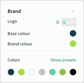 Brand styles
Smart theming
When you first upload a logo, Estii analyses the image, and automatically generates a complimentary, accessible colour palette for your theme. This theme is applied automatically the first time, subsequent times it will display a preview first.
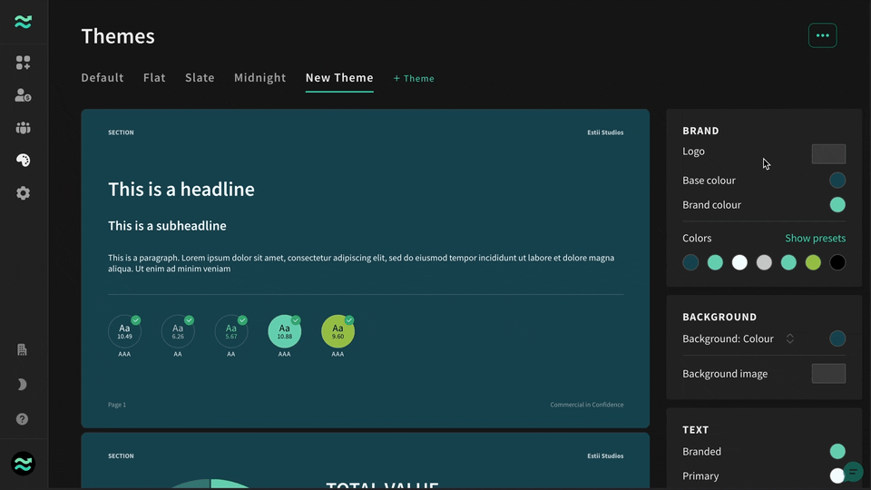 The theme wizard automatically generates a theme based on the uploaded logo
Background styles
- Set a background colour or gradient
- Upload a background image, and modify blur and opacity
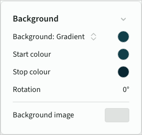 Theme background styles
Shape styles
Shape styles are used for charts and data visualisations such as timelines and resource plans.
- Fill colour - the background colour for shapes
- Hover colour - an alternate colour (or tint of the fill colour) to use when interacting with some shapes
- Text colour - a high contrast text colour to use on small labels that appear over the fill and hover colours
- Corner style for bar charts (circular, rounded, square)
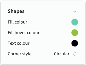 Theme shape styles
Text styles
Text colours that appear directly over the Theme background
- Branded colour for key information (primarily price)
- Primary colour for titles and normal text
- Secondary colour for subtitles and subtle text
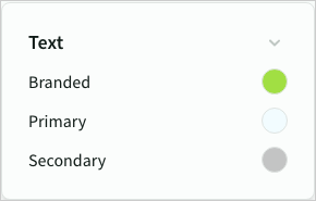 Theme text styles
Font styles
You can set fonts from the font library (a large selection from Google Fonts)
- Body font for most content
- Title font (and weight) for titles and headings
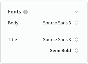 Theme font styles
Header and footer
Default values for common labels used across all templates. These can be overridden on individual deals.
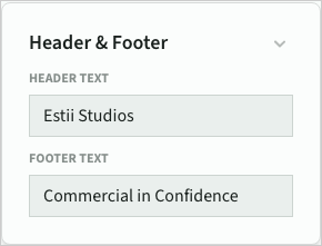 Default text for slide headers and footers